USER EXPERIENCE
USER EXPERIENCE
SideChef Grocery
SideChef Grocery
After forming a strategic partnership with Walmart, SideChef introduced shopping for recipes throughout the SideChef ecosystem. Expanding on the existing functionality of being able to create a shopping list, users could now shop for recipe ingredients with just one click.
After forming a strategic partnership with Walmart, SideChef introduced shopping for recipes throughout the SideChef ecosystem. Expanding on the existing functionality of being able to create a shopping list, users could now shop for recipe ingredients with just one click.
After forming a strategic partnership with Walmart, SideChef introduced shopping for recipes throughout the SideChef ecosystem. Expanding on the existing functionality of being able to create a shopping list, users could now shop for recipe ingredients with just one click.
ROLES
Lead Designer
User Research
YEAR
2020

With this new business initiative, we allowed users the functionality of shopping ingredients for recipes. A key differentiator for shopping with SideChef was our commitment to reducing food waste. To help users understand their food waste, we showed users how much of each ingredient they would use per recipe. We could leverage Walmart’s extensive product catalog to show rich information to our users and allow them to shop with their favorite brands by swapping ingredients.
We started with these basic capabilities of adding recipes to cart for check out but to increase our conversion we knew we needed to update our user experience. We looked to create a more drastic change that gave users the impression we were more than a recipe inspiration site, but a trusted place to get groceries as well. We conducted a Maze user test to validate our concept and gauge public perception of online grocery shopping.

We saw there was a promising number of people interested in online groceries and saw this as a great idea but their biggest hesitation was around credibility and trust.
For existing users, we faced the challenge of educating SideChef's new shift to e-commerce, and that users were purchasing ingredients to make a meal not a meal-kit or premade food. The app's architecture was restructured to emphasize grocery shopping by including shopping location on onboarding and prominently throughout the app navigation to enhance the idea of personalization.


After the first iteration of shoppable recipes, we revisited the design of the recipe cards to increase conversion. Visually, it wasn't clear to users that they were purchasing ingredients for recipes and not delivering pre-made meals or meal kit items. We looked to further develop our recipe card system throughout the ecosystem and tested multiple variations and call-to-action messages. With the launch of the new recipe cards in SideChef's 5.11 release, recipes clicked on increased by over 81%.

Along with unifying all the elements needed for users to make a decision on a recipe, we were able to create a consistent ratio for our recipe images moving forward.
Along with unifying all the elements needed for users to make a decision on a recipe, we were able to create a consistent ratio for our recipe images moving forward.
We eliminated unnecessary elements that we found from user research that was not helpful to decide on what recipe to make, such as serving size and having more than one recipe tag.
We ran an A/B experiment to observe what would increase the conversion rates of adding a recipe to cart. We tested 3 variants showing: the total price, the total amount of ingredients, and the price per serving. We discovered users' preferred number of ingredients because it puts into context how difficult or easy a recipe may be.


New recipe cards incorporated all the elements together and had a better visual cue to be clicked on to explore further. We also conducted A/B testing showing total price vs. total ingredients vs price per serving to test which would result in a higher click rate.
On the SideChef website, we took a similar approach to educate and reposition ourselves as an e-commerce recipe portal. We looked to optimize existing user journeys to better facilitate a seamless experience and also used the same visual updates from app on web for a consistent experience throughout both.

A new way to discover on home focused on shoppable recipes
Images created by Culinary Studio
This is an ongoing project as we continue to improve our conversion rate and further explore other areas we can improve on through usability research. We recently conducted usability research on our app and website users to observe their behavior and have already begun to make incremental changes moving forward.


see all projects
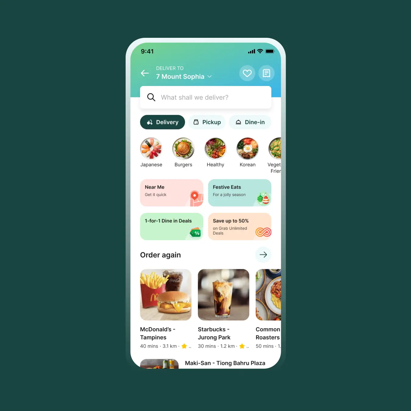
Grab Food HomeUser Experience

Okay ReadsPersonal Project

SideChef Meal PlannerEnd-to-End Product

SideChef 4.0 Brand IdentityBrand and Identity
Mouu CliqUser Experience

Ambi ClimateUser Experience